
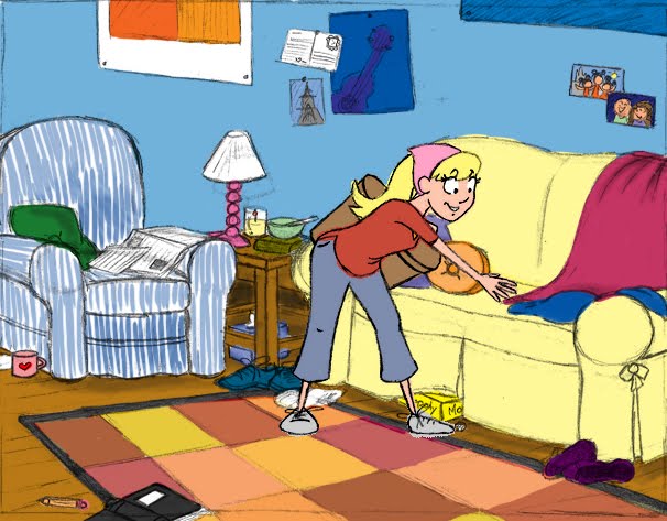

Alrighty, all. I need some feedback. I had originally planned to do watercolor backgrounds for my film, but due to me running completely off schedule, I'm considering going digital because it's easier, faster, and cheaper. The top picture was my first attempt, which is fairly normal and includes bright colors. But I have the problem that the background colors might wash out the character. I tried dulling it down, but then I wasn't happy with that either. Then I started thinking about the Xerox age, when they used a very small color palette and didn't really worry about lines or small objects. I think I like the second better, because it's different for me and can be really expressive in color. But what do you think? Any suggestions?

The top one really catches my eye and I like that. It says "Noelle" a bit more than the bottom I think. The bottom is a bit too blue for my liking, however I feel the character pops out a bit more with her red shirt instead of just being in the frame like the top one. If I had to choose, I'd go with the top one. Looks great Noelle!
ReplyDeleteI think you can take the bottom one to a little more of an extreme. Look at background from 101 Dalmatians, they're way outside the lines. I like that not everything is colored in. You can probably dull out the background a bit more as well, but I think they look really good!
ReplyDeleteI'd say go with the bottom one. The top one is too busy and bright, it pulls away from the character. While, on the surface that one may feel more detailed and 'you', that amount of detail isn't really reflected in the coloring of the character and I feel you can make the second one more 'you' simply through the color palette. I do think the bottom one still has too vibrant of colors that compete with the character. Get a hold of the 101 Dalmatians DVD, they have a lot of breakdowns of the line drawing then the color behind it in the extra features. I believe it was actually two artists who did the backgrounds. One would do the coloring (first I think)and make it real geometric and straight, then the second artist would go in and do the line work on top but making things more crooked and caricatured.
ReplyDeleteThe colors on the top one are distracting but at the same time the bottom one looks unfinished. Its fine to have the variety of colors that are in the top but the saturation and value are identical to the character. If you cranked up your character colors or dulled down/changed the temperature of the background colors your character would op right out.
ReplyDeleteThere are things good about both. Overall, I think I like the first one, but mostly that cool rug. I also think I know what might help you out with that "washing out" of the character. It all has to do with tonals. We should run into each other in the near future to talk about it - Layout to the rescue!
ReplyDeleteI like the first better, obviously because of my aesthetic, but i definitely think you can tone the saturation down a bit. I do like the second one too, but the blue feels a little intense and distracts me from the character more than in the first one. I pretty much agree with Stu.
ReplyDelete